Over the last 100 years, the variety of ink colors and processes have expanded rapidly to accommodate technological printing advancements. Unless you have been in the printing or creative design industry for a while, you probably don’t think much about the colors used, the various hues, or how colors are applied at a printing company. It’s easy to say “I want this shade of blue” and so long as it matches, you move on to the next project. When you actually stop to think about the evolution of our ink colors, it is quite a fascinating history.
Pantone® Printing
Prior to 1963, the colored inks that printers used varied not just from printer to printer, but even from project to project at the same printing company. There was no “standard” set of colors, rules, regulations, system, process – nothing. It was a “free for all” system, where each printer spent a considerable amount of time creating basic colors their customers’ wanted and those colors would vary drastically in each print run.
In 1963, a company called Pantone Inc. revolutionized the printing industry with the world’s first color matching system. Lawrence Herbert, a part-time employee trying to pay his way through medical school, saw the existing ink color complications and knew a standardized color matching system could improve business operations for Pantone®. He used his knowledge of biology and chemistry to develop an easier way to match the company’s pigments. Herbert used a basic palette of 10 colors and a numbering system to make it easy to communicate exactly what color to use in the printing process. The Pantone® Matching System (PMS) reduced the amount of printing colors by over 80%, improved business functions dramatically, and became so popular in the printing industry that other industries adopted the system as well. Using the basic 10 color palette, printers could also mix colors together to get different colors.
As technology advanced, Pantone® was able to expand beyond their basic 10 color palette to offer customers more choices. Today, they boast an astonishing 2,161 different colors and even pick a “Pantone® Color of the Year” to feature to their customers (this year it is Pantone® 17-3938 Very Peri).
RGB Printing
The Red Green Blue color model actually originated in 1861 but it was not intended for printing purposes. James Clerk Maxwell experimented with taking photographs of the same scene through red, green, and blue filters. He then projected the images through the same filters in a darkened room so these primary colors combined would reproduce the entire scene in full color.
While the concept might have been created in the 1800’s, it wasn’t until the rise of color TV that RGB became more important. The RGB color model uses a 3-part numerical naming process where the 3 numbers have to be between 0-255. The first number represents the amount of red your color needs, the second number represents the amount of green your color needs and the third number represents the amount of blue your color needs. By adding varying amounts of each type, you can have a very exact match of color in your project.
Eventually, the RGB color model would make its way onto our computer screens and graphics designer programs where the RGB colors dominate for artwork created on screen. In the RGB color model, pixels on a digital monitor appear as one of three colors when magnified. When white light is emitted through the screen, it blends the three primary colors on the eye’s retina to produce an array of other colors. The more color beams the device emits, the closer it gets to white. However, emitting no color beams results in black. RGB is ideal for digital media designs because these mediums emit color as red, green, or blue light. Today, there are over 16 million different color combinations that can be created through the RGB color model.
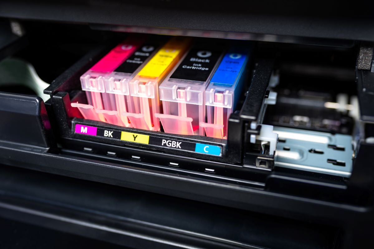
CYMK Printing
The Cyan Magenta Yellow and Black (CMYK) color model is the exact opposite of the RGB model. Instead of adding various amounts of each color to create a specific color, CYMK actually subtracts the color from natural white light to create specific colors. The Eagle Printing Ink Company was the first to demonstrate this type of color printing back in 1906 when they placed Cyan Magenta Yellow and Black colors on top of one another, then removed a little of each one to see the color shade change. Just like RGB, CYMK uses a similar 4-part numbering system that tells a designer or printer exactly how much of each color needs to be removed to achieve the right shade. Today, there are over 16,000 different color combinations through the CYMK color model.
So, what does this have to do with Printing?
Each coloring model requires a different process for the printer to achieve the final result. Initially, most printing presses were either 1 or 2 color presses. If you wanted more colors or wanted to print in CMYK it would require multiple passes through the press. And, it would become more expensive. So, because of the extra expense most people printed their projects in only 1 or 2 colors until about 20 years ago. This legacy is the reason most all logos are 1 or 2 colors even now.
Today, however, because of the rise of digital (and now Inkjet) printing, PMS colors are more expensive for a printer to produce. Many printing companies do not even print PMS colors any more. Businesses are adjusting their brand guidelines to CMYK models in their printing instead of PMS. RGB has a wider range, or gamut, of colors and it is not possible to reproduce all the colors you see on a screen in printed ink, since ink does not emit light. If you design an RGB graphic for the web, it may not look the same when you go to print it.
Graphics created in RGB must be converted to CMYK in order to be printed. Most printing companies do this automatically. However, automatic color model correction can lead to an unpleasant surprise when you see the finished product. It may not have the right colors to match your brand. Designer monitors should be calibrated to CMYK for print as the color combinations are more limited. The default setting from most monitors from the factory is for gaming, and is too bright for an accurate representation of CMYK printing.
Avoid this potentially costly issue by either converting your color model or designing in CMYK from the start. Not sure what ink color model you are currently using? Reach out today and we can help you identify your current color model or transition to CYMK.